Most of you have already read or heard about the recent false alarm incoming missile alert that happened in the Hawaiian island chain.
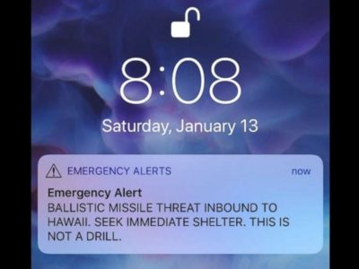
In a nutshell, most residents and tourists with cellphones received an emergency SMS text message on their phones with the following message:
“BALLISTIC MISSILE THREAT INBOUND TO HAWAII. SEEK IMMEDIATE SHELTER. THIS IS NOT A DRILL.”
The Hawaiian state had recently reinstated a new statewide emergency alert system amid fears about the potential threats of countries like North Korea, who claim they now have the nuclear capability to strike the US and related territories.
As you can imagine, the statewide alert caused a massive panic among residents and tourists of Hawaii.
But you’ve probably already deduced by now that there was no missile attack on Hawaii.
The emergency alert was sent out in error. It took about 38 minutes from the time the initial alert message was sent out before a follow up false alarm was sent, so of course, there was no reason to believe the alert WASN’T the real deal.
As it turns out, the civil defense employee who triggered the alert unintentionally selected the wrong menu option. He meant to select the menu option to send out a TEST alert message which would contain some sort of wording to indicate the alert message was ONLY A TEST.
Apparently, both menu options were located right next to each other, and the employee selected the wrong menu item.
That one human error triggered massive panic and pandemonium in the real world.
[bctt tweet=”Just one human error triggered massive panic in the real world. Could better #UX have prevented it? ” username=”profocustech”]And as expected, there are LOTS of people angry because of this fiasco. And probably a lot of anger directed at that employee who was responsible for sending out the alert.
But I don’t think the blame should be directed at the actual employee who triggered the alert.
We’re all human and we all make mistakes.
I think the fault needs to be directed at the original design team responsible for the user interface/user experience of the software application, which the employee had to use.
As software designers, we often like to blame the end users for using our creations incorrectly.
Remember Steve Jobs’s famous “You’re holding it wrong” quote during Apple’s AntennaeGate iPhone fiasco? He blamed iPhone users for holding the iPhone incorrectly, which would cause overall signal reception to decrease. When in fact, the fault lay in the design and placement of the radio antennae sensors embedded in the spot where most people would naturally wrap their hands and fingers around the iPhone.
Apple doesn’t often make mistakes in the design of their products, but in this case, the blame can be placed squarely in their lap… they didn’t think carefully enough about the user experience of hand placement on their phones when they were deciding where to place their radio antennae. If they did, they would have either relocated it and/or placed another radio antennae on the other side of the iPhone to ensure at least one radio antennae was getting enough signal strength needed for data/cellular connectivity (which they, of course, did on future iterations of their iPhone).
Apple’s mistake was embarrassing and worse yet, they attempted to excuse their design flaw by blaming the end user for the problem.
In Apple’s case, it did cause quite a kerfuffle and bad press and publicity for the company. But in the grand scheme of things, it wasn’t the end of the world.
In the case of the false alert incident which happened in Hawaii, we literally ARE talking about real end-of-the-world consequences!
Most software development has limited real-world impact when things go wrong with software. Sure, there can often be lost revenue for an organization if software fails to do its job properly, but as damaging as that is, it’s still limited to that particular organization.
But there are times like this unfortunate incident, where improper UI/UX design can literally be the difference between life and death.
Because of this false alert, I can imagine many residents and tourists being wary about the next time a statewide emergency alert is sent out. I wouldn’t blame many citizens for ignoring a future alert message… they screwed up the first time, so what would make them believe the second time was any better?
But what if the next alert was THE REAL DEAL? You’d want to alert as many people as possible to seek shelter immediately, wouldn’t you? By creating lost confidence in these kinds of alert systems, you’ve weakened their effectiveness and capability.
God forbid, many people would lose their lives because they believed it was a false alarm, when in reality, it was the real thing.
I don’t have access to any screenshots or schematics of the application that triggered that emergency alert system, but based on the information I’ve read so far in the media, I’m making some educated guesses and conclusions about what went wrong with the user interface and user experience layout of the application.
First of all, why the heck are the menu options to send out a TEST and REAL emergency alert located right next to each other?
In something as important as triggering a real life alert system that will affect thousands of citizens statewide, you’d want to put that menu option in some isolated section of the application which requires special authorization in order to initiate.
Speaking of authorization, wouldn’t you want the end user to put in a special password, or security credentials process, in order to send out a real alert?
And what about other user experience safeguards, like requiring more than one person to initiate a real statewide emergency alert?
There’s a reason why our military has put in a security safeguard where it is literally impossible for a single person to turn a launch key for a nuclear missile … it requires TWO authorized personnel, who agree with a launch order, to twist their keys at the same time, to launch a missile.
For something as important as triggering a statewide emergency alert system, wouldn’t you want to make sure you have plenty of processes baked into the design and look and feel of the software as well?
A simple confirmation alert box could have prevented this end user mistake if the end user was prompted with a message box like “Please CONFIRM you wish to send out this REAL ALERT.”
Most of the time, mistakes in software design have limited real-world consequences.
But in this case, bad UI/UX can be a matter of life and death.
And I’m guessing the original software design team behind that emergency alert system is going to have an interesting future sprint retrospective meeting… I wonder if that meeting will be open to the public? 🙂